Food Education Australia is a non-profit focused on transforming how communities engage with food. Through hands-on programs and educational workshops, they promote wellness, sustainability, and food literacy. Their initiatives empower individuals, especially youth, to make informed food choices, addressing issues like health disparities, sustainability, and social enterprise.
UX Role:
End-to-End UI/UX Designer collaborating with a Senior Designer and Product Team.
Mission:
To overhaul the homepage and donation process. Focused on improving user experience for donors, developing a persuasive content strategy, and optimizing the design for better conversion rates while ensuring a streamlined, accessible donation flow.
Timeline:
March 21, 2024 - May 10, 2024
Key problems to solve:
Streamlining Donation Process-
Redesigning the donation flow to make it intuitive and user-friendly, improving conversion rates.
Balancing User Needs-
Creating a seamless experience for both donors and volunteers, ensuring the site supports both community engagement and donations.
Enhancing Visual and Content Strategy-
Developing persuasive calls to action and a visually compelling homepage to encourage donations and participation.
Challenges I encountered:
Creating a Donor-Centric Experience:
The biggest challenge was ensuring the website focused primarily on converting visitors into donors, while still providing a smooth user experience without overwhelming them with information.
Optimizing the Donation Flow:
Simplifying the donation process to ensure it was fast and intuitive, while maintaining flexibility for users to choose different donation amounts and payment methods, posed a challenge in minimizing potential drop-offs without complicating the user experience.
Persuasive Yet Minimal Content:
Balancing between compelling storytelling and clear calls to action for donations was a challenge, as too much content risked deterring users from completing their donation.
Delving deeper into the process…
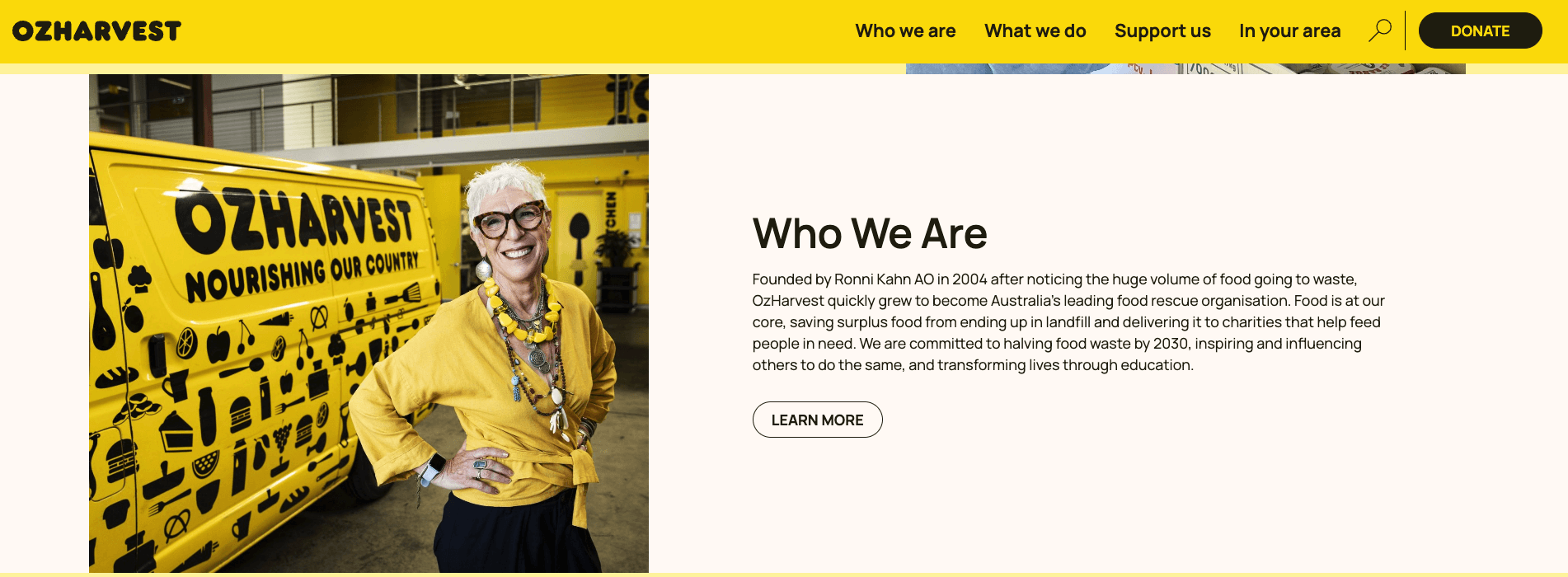
Competitive Analysis
As part of my design process for Food Education Australia (FEA), I conducted a competitive analysis of platforms such as Food for Soul, Oz Harvest, Red Cross, World Food Programme, Food Bank, Eat Up, and Nutrition Australia. By analyzing their home pages and donation flows, I identified key strengths and areas for improvement. This research uncovered valuable insights and inspired innovative features for FEA’s user experience. I’ve included screenshots from some of these platforms, showcasing impactful features that guided my design decisions, ensuring FEA’s interface integrated best practices while meeting the specific needs of its users.
In-depth Interviews
The interview method was used to deeply understand user needs and expectations , providing valuable insights and feedback. This helped shape the product's functionality, improve existing features , and suggest new ones.
6 Respondents
Group Age- 23 years- 65 years
Emily Johnson

Demographics:
Age: 34
Gender: Female
Location: Melbourne, Australia
Occupation: Marketing Manager
Education: Bachelor’s Degree in Communications
Behaviours:
Engages with social media to follow causes and stay updated on their activities.
Frequently donates to non-profits online, using her smartphone for convenience.
Appreciates clear, concise communication and compelling stories that illustrate the impact of her support.
Preferred Features:
A user-friendly donation interface with minimal steps.
Clear information on donation impact and transparency.
Engaging content that tells stories of individuals or communities benefiting from the support.
Background:
Emily has a strong interest in community initiatives and social responsibility. She works in marketing for a non-profit organization and is passionate about using her skills to promote causes that matter to her.
Goals:
To support organizations that promote food education and sustainability.
To find a simple and efficient way to donate to causes she believes in.
To stay informed about the impact of her contributions and the programs she supports.
Challenges:
Overwhelmed by Information: She often finds donation websites cluttered and confusing, making it hard to navigate.
Lack of Transparency: Emily wants to see clear information about how her donations are used and the impact they have on the community.
Time Constraints: With a busy job and family commitments, she needs a quick and easy donation process without unnecessary steps.
Motivations:
Emily is motivated by a desire to make a positive impact in her community and to contribute to food justice initiatives.
She values transparency and accountability from the organizations she supports.
The solution phase…
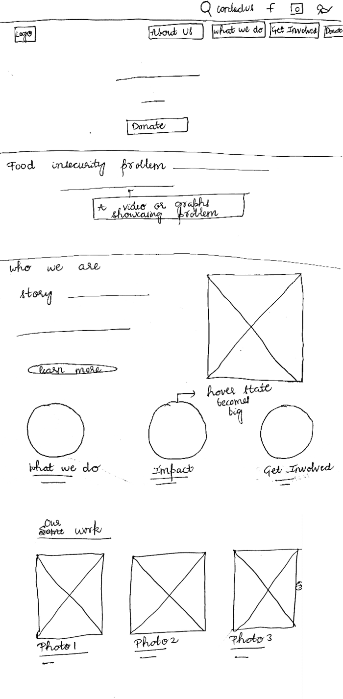
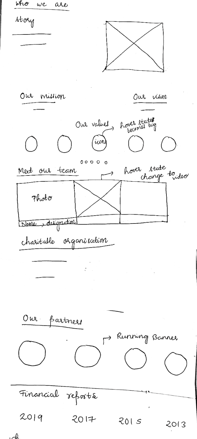
I began the solution phase with simple hand-drawn sketches, turning rough ideas into wireframes that shaped the structure. With feedback guiding the process, I refined these into the final designs, focusing on clear navigation and a user-friendly experience that drives donations and volunteer engagement.
Usability Testing…
For Food Education Australia (FEA), I facilitated usability testing with six participants that I personally recruited. This hands-on approach allowed me to gather valuable insights into user interactions with the platform. By observing their behaviors and feedback, I was able to pinpoint areas for improvement, ensuring the design effectively meets user needs and enhances the overall experience.
key insights…
01
Mission clarity
5 users stopped at the hero section but couldn’t understand what Food Education Australia stood for. The visuals drew them in, but the purpose wasn’t clear. This revealed a key insight: we needed a stronger message that instantly conveyed our mission of food education and empowerment.
02
Call to action for volunteering
4 out of 6 users struggled to find the volunteering option on the homepage. This highlighted the need for a more prominent and intuitive "Volunteer" button to enhance user engagement and make the option easily accessible.
03
Impact Statistics
3 users expressed the need for statistics on the impact page. The lack of concrete numbers left them uncertain about the organization's credibility. They wanted to see measurable data, like the number of people impacted or programs delivered, to build trust and confidence in Food Education Australia's effectiveness.
The design and the decisions…
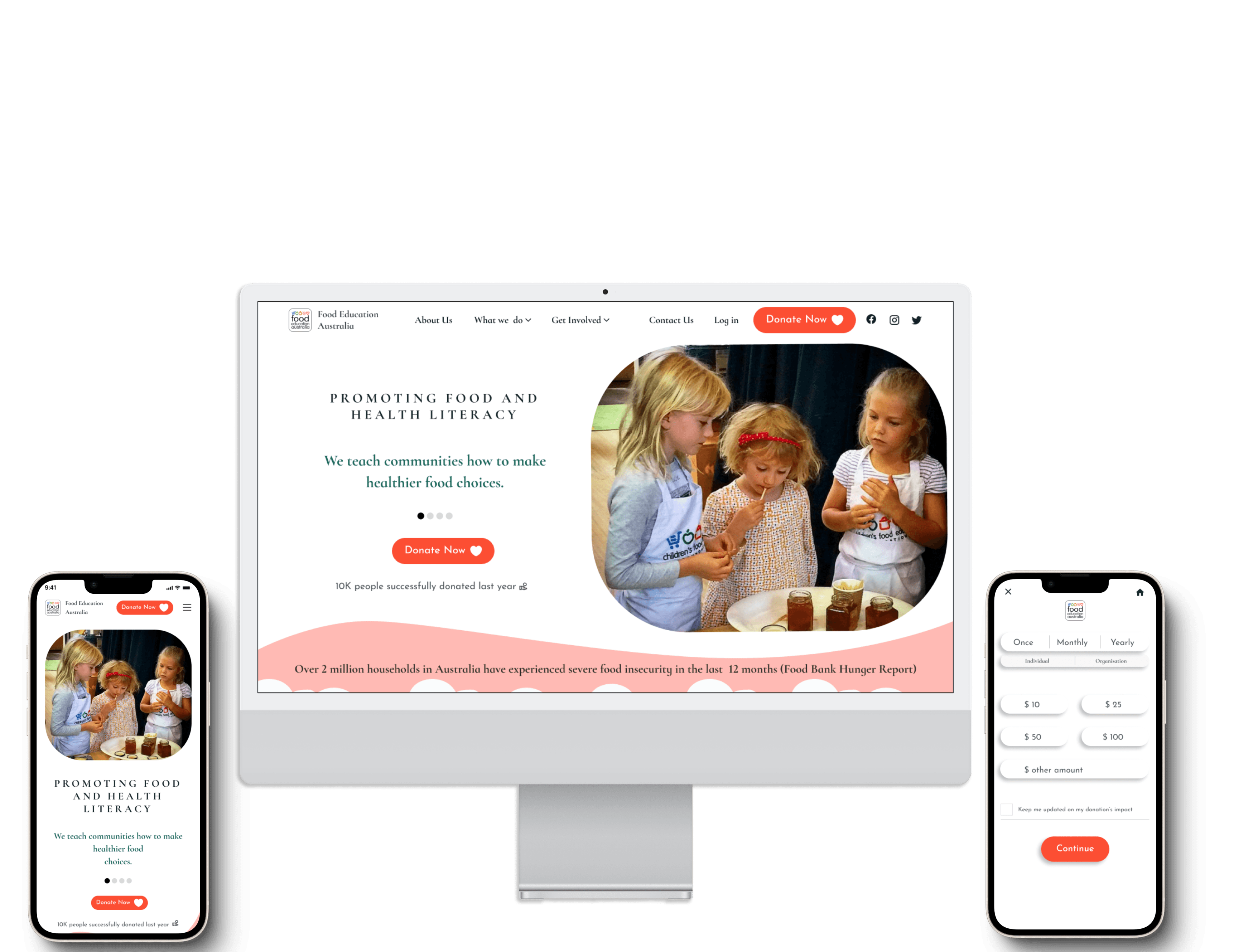
I wanted users to feel a deep connection with FEA’s mission. Through clear messaging and visuals, I aimed to create an emotional bond, making it easy for visitors to understand the cause and feel inspired to support. The design focused on creating this connection while keeping the donation process simple. I aimed to ensure users could easily donate via phone by designing for both web and mobile versions.
01 Challenge:
I had to create a strong first impression by balancing engaging visuals and clear messaging to convey FEA’s mission effectively.
Solution:
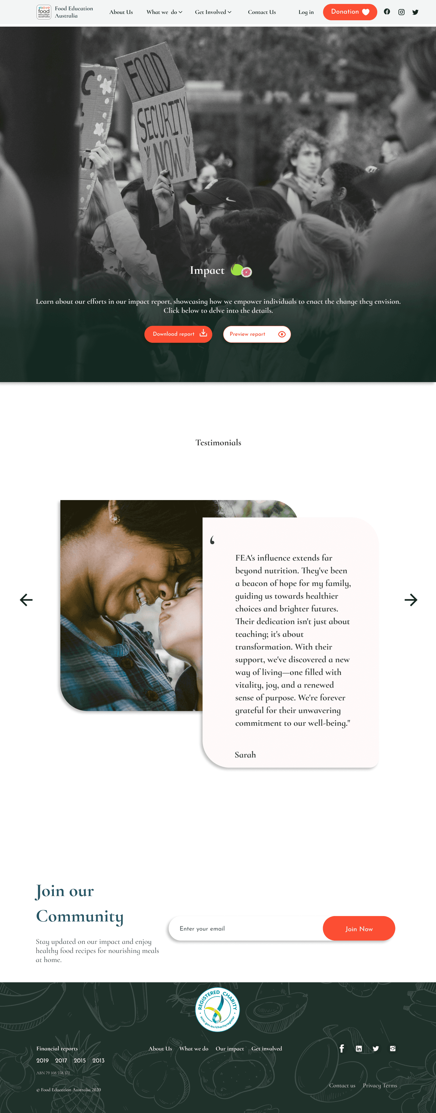
I envisioned the homepage as more than just an introduction; it serves as a gateway for visitors to genuinely connect with FEA's story and mission.
Dynamic Hero Section Animation: The hero section features animated headings that display these core messages sequentially, capturing users’ attention and clearly conveying FEA’s purpose.
Intuitive Navigation: I included micro-interactions to enhance navigation, making the site enjoyable and user-friendly.
Building Trust: A certified NGO badge is prominently displayed to establish credibility and reassure users of FEA’s legitimacy.
Prominent Call-to-Action Buttons: Strategically placed, visually appealing call-to-action buttons guide users seamlessly through the site.
Connecting Users to Impact: The "See Impact" button directs users to a video showcasing FEA’s real-world impact, fostering a personal connection with the organization.
02 Challenge:
I had to create an emotional connection that motivates users to donate, while ensuring the donation process remained simple and intuitive.
Solution:
I prioritized a clean and user-friendly layout.
Giving card: Emphasizing the significance of giving in the donation process, based on usability testing, creates an emotional connection with individuals. It strengthens their sense of purpose and tie to the cause, motivating them to donate.
Prominent CTA: The "Donate Now" button stands out in the hero section, encouraging users to take immediate action.
Dynamic Donations Ticker: A scrolling bar at the bottom shows live donation updates, fostering a sense of community and urgency.
FAQs Section: A well-organized "Find Answers to Your Questions" section provides clear answers to common queries about donations and FEA's mission, enhancing transparency.
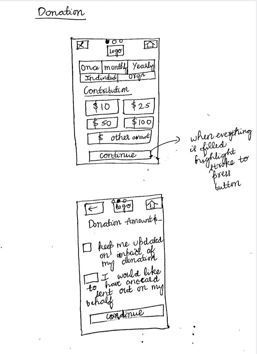
03 Challenge:
Designing a streamlined donation flow across all interfaces that allows users to quickly select an amount and feel confident in their contribution.
Solution:
To simplify the donation process, I crafted a mobile-first, clean pop-up design that offers users clear options with minimal effort. Key amounts are displayed upfront, while the "other amount" option and an impact update checkbox personalize the experience. The bright CTA guides users seamlessly to complete their donations, enhancing usability and encouraging contributions.
04 Challenge:
Users wanted to see real evidence of the organization’s impact, but overwhelming them with too much information risked losing their attention.
Solution:
Instead of overloading the home page with all the impact data, I dedicated a separate impact page. This page featured visually appealing infographics and heartfelt testimonials, allowing users to explore FEA’s achievements in a more focused and engaging way. This solution helped maintain a clean and clear homepage while offering users a deeper look into FEA’s positive impact.
My Learnings…
I wanted users to feel a deep connection with FEA’s mission. Through clear messaging and visuals, I aimed to create an emotional bond, making it easy for visitors to understand the cause and feel inspired to support. The design focused on creating this connection while keeping the donation process simple. I aimed to ensure users could easily donate via phone by designing for both web and mobile versions.
Overview