Mockups showcasing the Thumbnail Creation page(right) and Smart Insights feature(left)
My role
End-to-End UI/UX Designer collaborating with a Senior Designer and Product Team
Company
Neutopia
Industry
Neutopia operates in the learning and development industry, with a focus on community engagement and education technology.
Timeline
July 2024 - Sept 2024
Key problems to solve
How Might We
"HMW provide community admins with real-time, actionable insights to help them make data-driven decisions quickly and effectively?"
"HMW simplify the content creation process for admins without design experience, while ensuring that the content produced remains visually appealing and impactful?"
"HMW leverage AI to automate and streamline repetitive tasks, empowering admins to focus on community engagement and high-level strategies?"
Challenges I encountered…
Understanding Admin Needs
Initially, it was challenging to fully grasp the diverse needs of community admins, especially in terms of how they interact with data and what specific insights would help them optimize their performance.
Balancing Simplicity and Functionality
Another challenge was finding the right balance between simplifying the content creation process for non-designers while still offering enough functionality to create engaging, high-quality content.
Integrating AI Effectively
While the goal was to leverage AI for content creation and task automation, integrating these features in a way that felt seamless and intuitive for admins required careful consideration.
Results…
As the project is still in the development phase, Neutopia conducted a survey to assess community admins' satisfaction rates. Initial findings show promising results, with many admins reporting increased enthusiasm for the new features aimed at enhancing content creation and community engagement. Further analysis will help quantify satisfaction levels as development progresses.
82%
Admins are enthusiastic
Delving deeper into the process…
Heuristic Analysis
To begin with, we conducted a heuristic analysis to identify usability issues and areas for improvement within the platform. This helped us understand the current user experience and evaluate how effectively the platform was meeting the needs of community admins. By applying established usability principles, we pinpointed gaps in functionality, navigation, and ease of use, laying the groundwork for informed design decisions moving forward.
Screenshot of Heuristic Analysis- Miro Board
Competitive Analysis
As part of my design process, I performed a competitive analysis of platforms like Kajabi, Circle, Mighty Networks, the tribe, Thinkific to explore how they handle community building, content creation, and user engagement. I also examined platforms like Sana AI and Canva for AI integration inspiration.By examining their strengths and weaknesses, I uncovered valuable insights and opportunities for innovation. To highlight this, I’ve included some screenshots from some platforms showcasing a feature I found particularly effective. These features served as inspiration for my design solutions, allowing me to integrate best practices while addressing specific needs in Neutopia’s user experience.
In-depth Interviews
The interview method was used to deeply understand user needs and expectations , providing valuable insights and feedback. This helped shape the product's functionality, improve existing features , and suggest new ones.
8 Respondents
Group Age- 23 years- 55 years
Below, I’ve outlined the core issues and the valuable insights gained from my user interviews, which formed the foundation for my design approach.
Problem:
Information Overload
Admins struggled to make sense of complex analytics data, which led to delays in decision-making and affected their ability to respond promptly to community needs.
Time Constraints
Due to their busy schedules, admins needed faster, more efficient ways to create and manage content without sacrificing quality.
Lack of design skills
Many users lacked formal design training, making it challenging to produce visually appealing content, especially when working with limited tools and resources.
Insights:
Simplified Analytics
Users require analytics that do more than just present data—they need actionable insights and clear recommendations to drive decision-making and save time.
Streamlined Content Creation
Admins value intuitive content creation tools that allow them to design engaging materials quickly, even without design expertise.
Customization and Flexibility
Users seek the ability to personalize their content creation workflows and community management strategies based on their audience's behavior and preferences.

The solution phase…
Sketches
During the sketching phase, I began by exploring various layouts and user interface elements to address the key challenges identified in the initial research. I used paper sketches and digital tools like Figma to quickly iterate on ideas, focusing on creating an intuitive experience for community admins. This phase allowed me to visualize how AI-powered insights and content creation tools could be seamlessly integrated into the platform.
By sketching out potential solutions, I was able to evaluate different design possibilities, experiment with layouts, and ensure that the core functionality remained clear and user-friendly. The rough sketches provided the basis for developing the initial wireframes, which helped establish the foundational layout and structure of the pages.
Below are the wireframes, showcasing the transition from concept to a more defined design.
Initial Grey/scale Wireframes
Usability Testing…
After converting wireframes into initial designs, I conducted usability testing to gather feedback on the user experience and identify areas for improvement. I validated my interface with five participants from Neutopia, whose information was supplied by our client, as well as three of my personal acquaintances. I iterated on my designs based on the feedback received.
Below are images of the initial page designs accompanied by key insights from usability testing.
This page features a course outline creator. Later, I replaced the 'Cancel' button (where the arrow points) with a 'Skip' button.
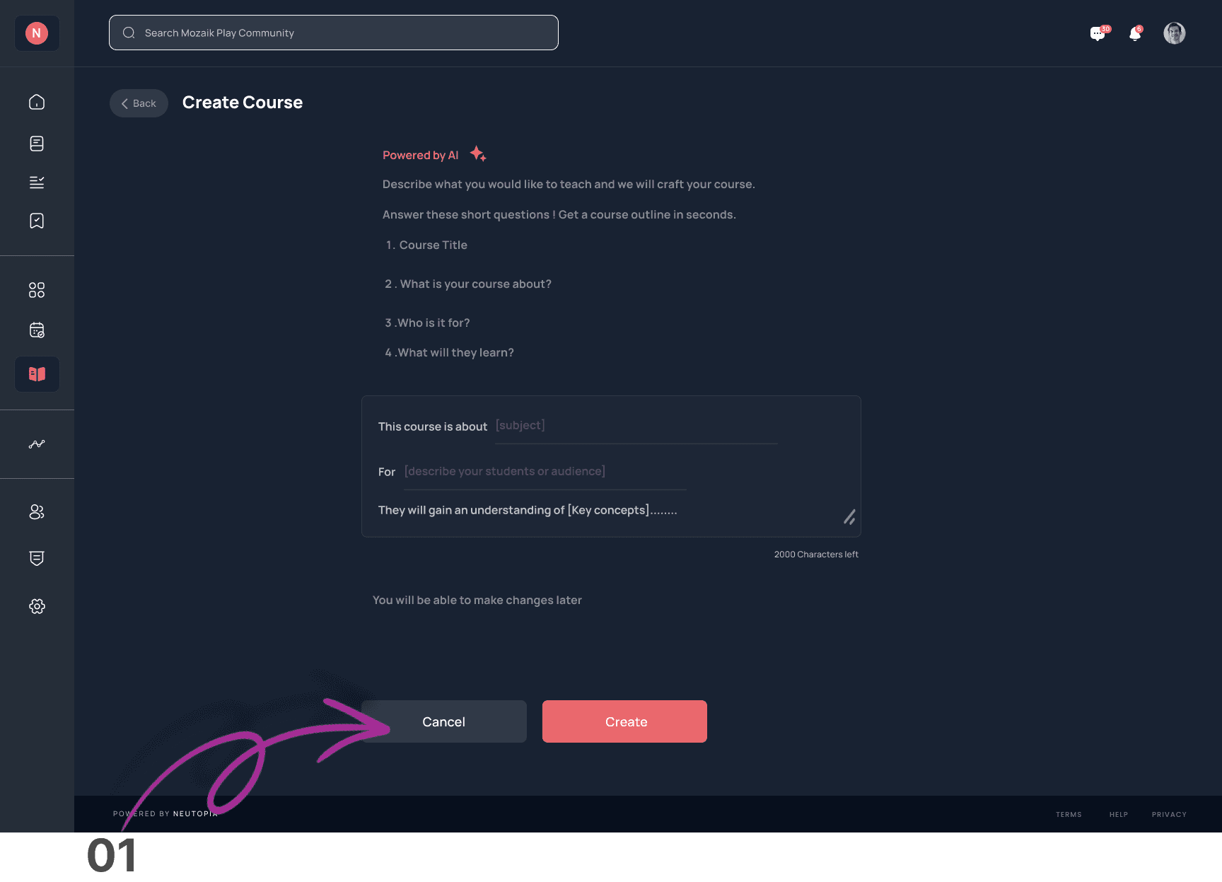
01. Skip Button
While users appreciated the AI-powered tools, five of them expressed a desire to skip the AI outline generator and create content manually. This feedback encouraged me to add a skip button.
This page features analytics, specifically focusing on content interaction metrics. Element 02 (where the arrow points) represents the smart insights section, while Element 03 highlights the search bar functionality.
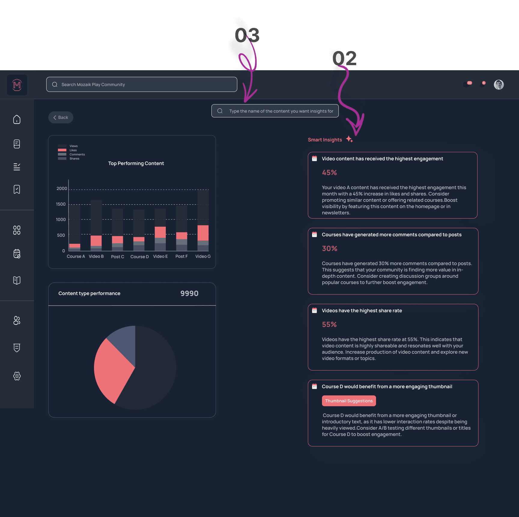
02
Smart Insights visibility
Despite incorporating smart insights into the metrics solution, 4 users did not notice or engage with this feature. This feedback highlighted the need to make these insights more visible and intuitive within the design.
03
Dual search functionalities
5 users were confused by the presence of two search bars—one for analytics and another in the main header of Neutopia. Based on this insight, we streamlined the interface by combining the search functionalities for improved clarity and ease of use.
This page features analytics, specifically focusing on user engagement metrics. Element 04 (where the arrow points) represents filters, while Element 05 indicates the area where the share and download buttons will be added.
04
Demographic Filters
3 Users requested demographic filters in the analytics dashboard , enabling better audience insights and more tailored content strategies.
05
Share and Download Button for Metrics
4 users also requested the ability to easily share and download metrics. They needed a way to export data reports in various formats (e.g., PDF, CSV) to share with team members or stakeholders. The arrow in the 05 Element points to the spot where I later added the Share and Download buttons in my design.
The design decision…
As a UI/UX designer, my focus was on three key aspects: analytics, content creation, and gamification. However, after considering Neutopia's structure—where only community members can access specific features—I decided not to prioritize gamification. I felt it wouldn't significantly enhance engagement since the closed community model already fosters interaction within a defined group. Instead, I emphasized improving the analytics and content creation tools, which I believe would deliver more value in driving user engagement and platform success.
The Final design…
I created designs for both mobile and web platforms, ensuring a seamless experience across devices. I went through multiple iterations before arriving at the final solution, refining the design based on feedback and testing to ensure it effectively met user needs and delivered a smooth experience.
In this section, I outline four distinct user experience challenges I encountered during the design process. For each problem, I’ve included relevant images of the final designs or prototype flows, followed by the corresponding solutions developed to address those challenges.
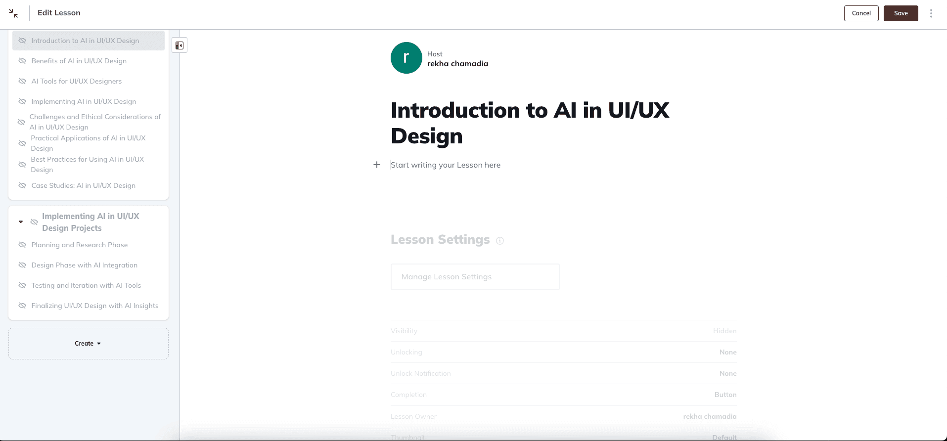
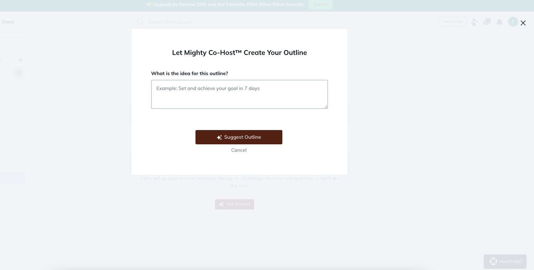
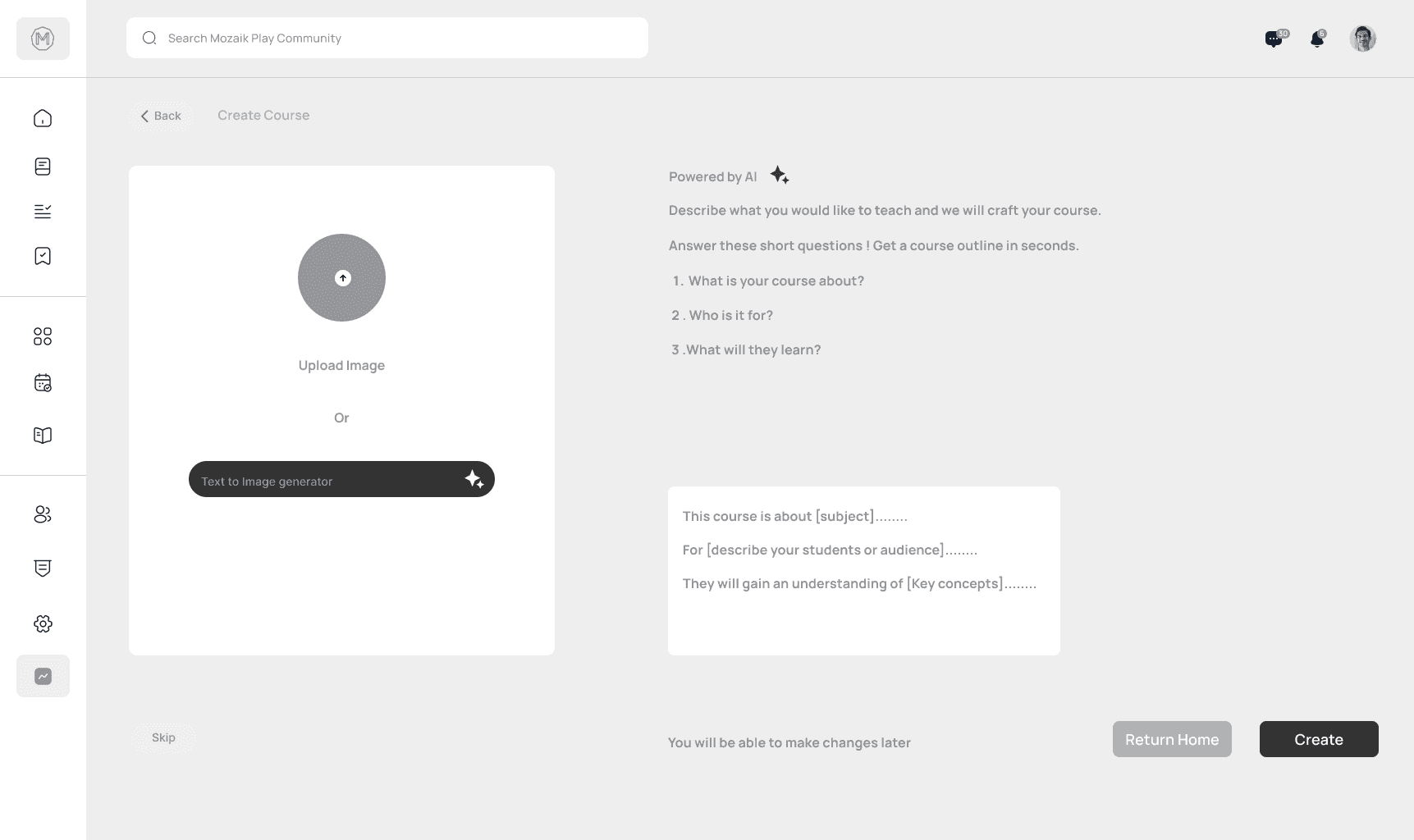
Final Design of course outline generator page
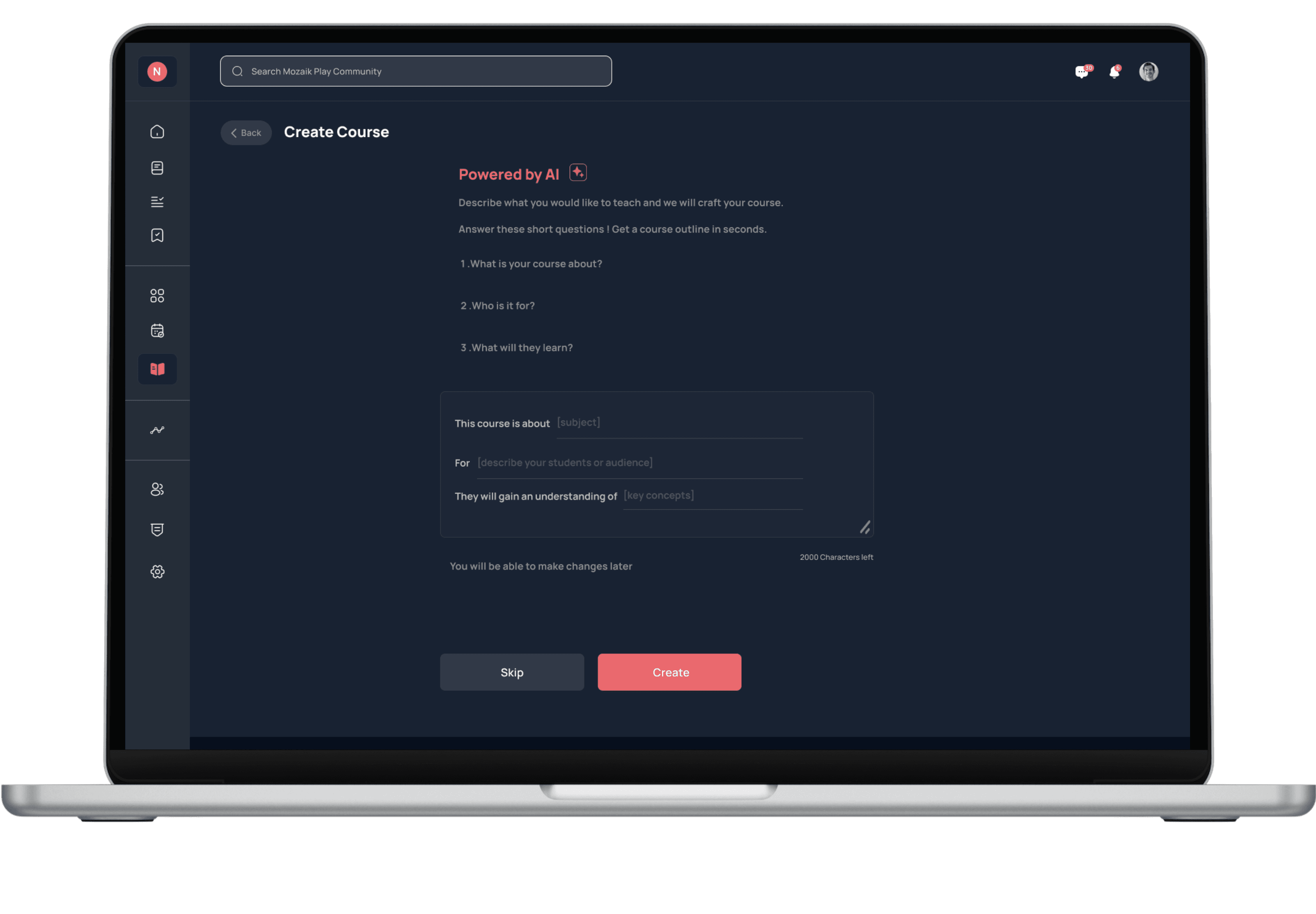
01
Problem:
Starting a course outline can feel overwhelming and time-consuming for community admins.
Solution:
To solve this, I developed the AI Course Outline Generator integrated directly into the platform. This allows admins to input key course details and receive tailored outlines, all without needing third-party tools. For those seeking more control, a “Skip” button enables them to bypass the structure. This solution empowers admins to focus on delivering impactful learning experiences while saving time and boosting creativity.
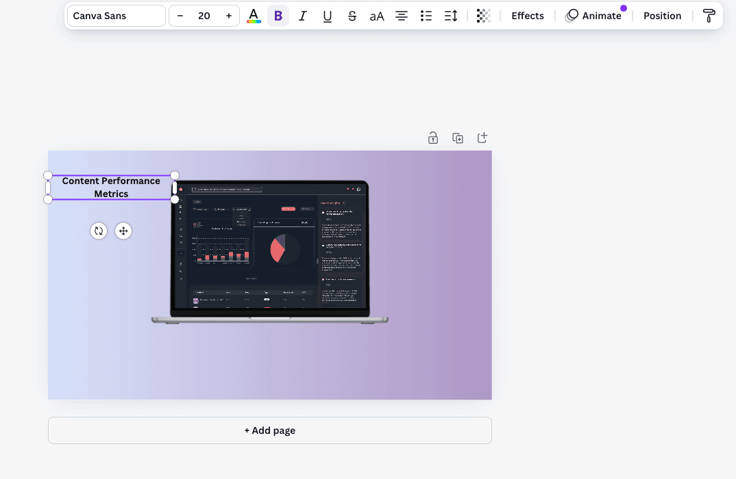
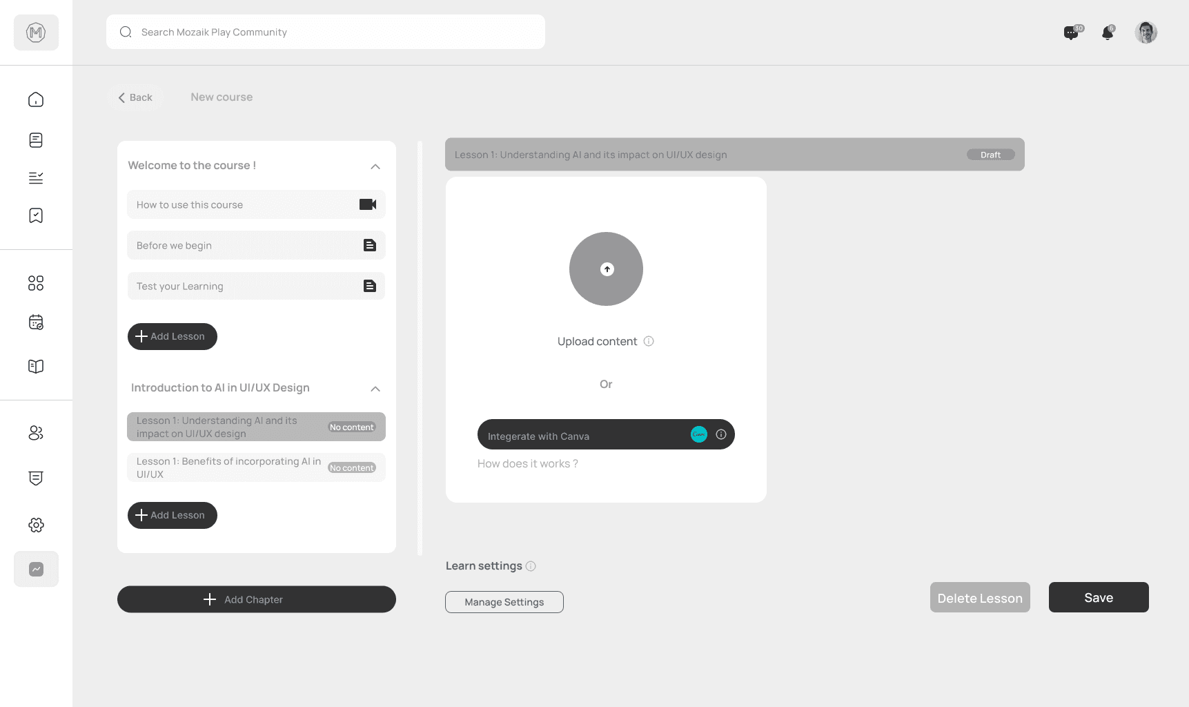
Final Design of Thumbnail creation page
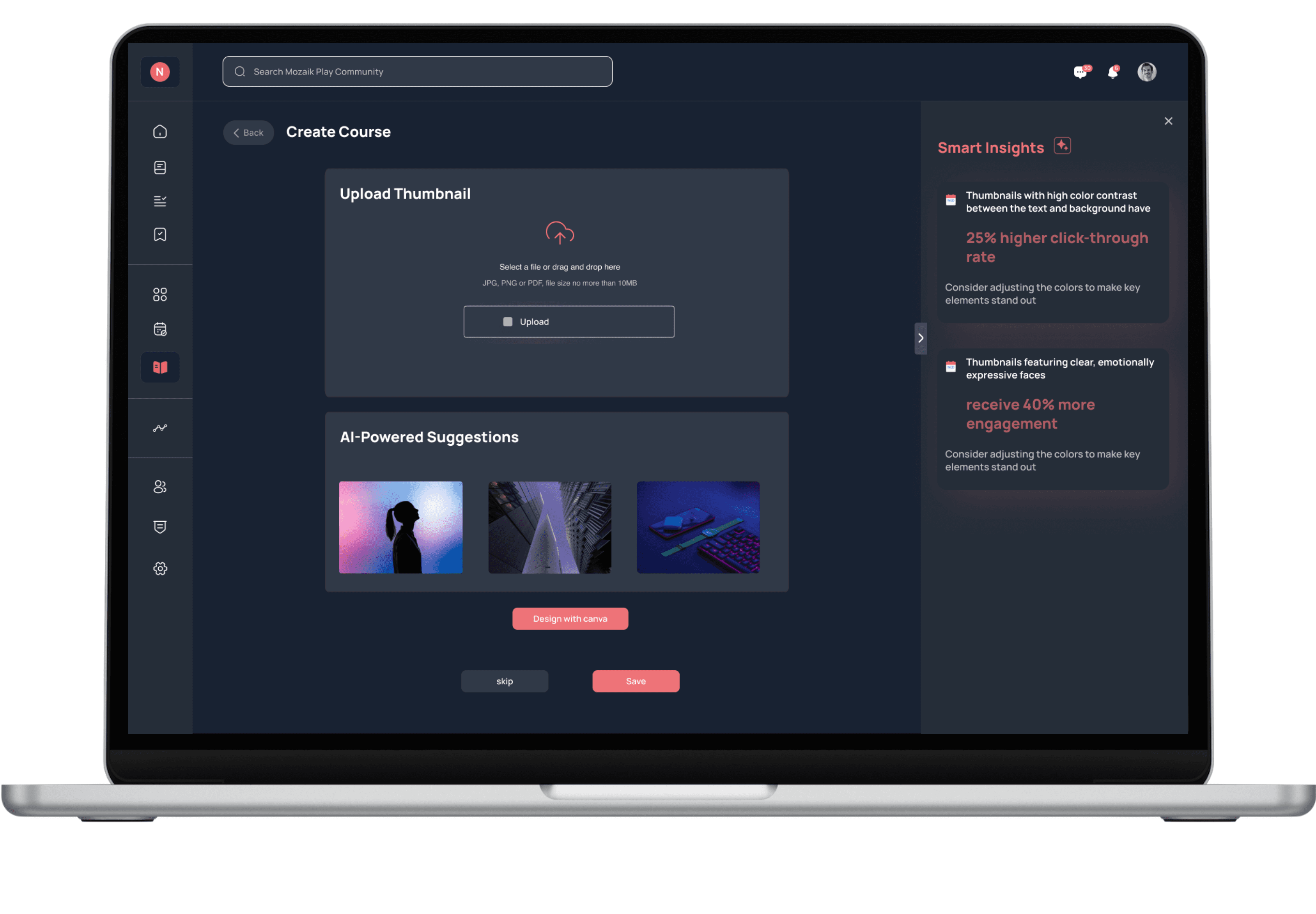
02
Problem:
Admins often found themselves struggling to create visually engaging thumbnails in a short amount of time. The tools were either too complex or didn’t offer the kind of quick, creative guidance they needed.
Solution:
To solve this, I redesigned the thumbnail creation process with simplicity at its core. Now, admins can easily upload or create thumbnails with built-in AI-powered suggestions and a seamless Canva integration right inside the platform. The AI offers real-time insights, like suggesting color contrast improvements or element repositioning, making the process feel effortless. This way, admins can focus on crafting compelling visuals without the stress, knowing they’re optimizing for better engagement while saving valuable time.
Prototype flow showcasing streamlined course content creation
03 Problem:
Admins often struggle with the creative load of writing course descriptions, making it challenging to produce engaging content quickly.
Solution:
To solve this, I designed a course description page inspired by "Canva's Magic Write." When admins select any text, a formatting toolbar appears, along with an AI icon. By clicking the icon, admins can generate suggestions from scratch or choose options to rewrite, condense, or enhance their existing content. This feature streamlines the writing process, allowing admins to either create or refine descriptions with ease while maintaining creative control.
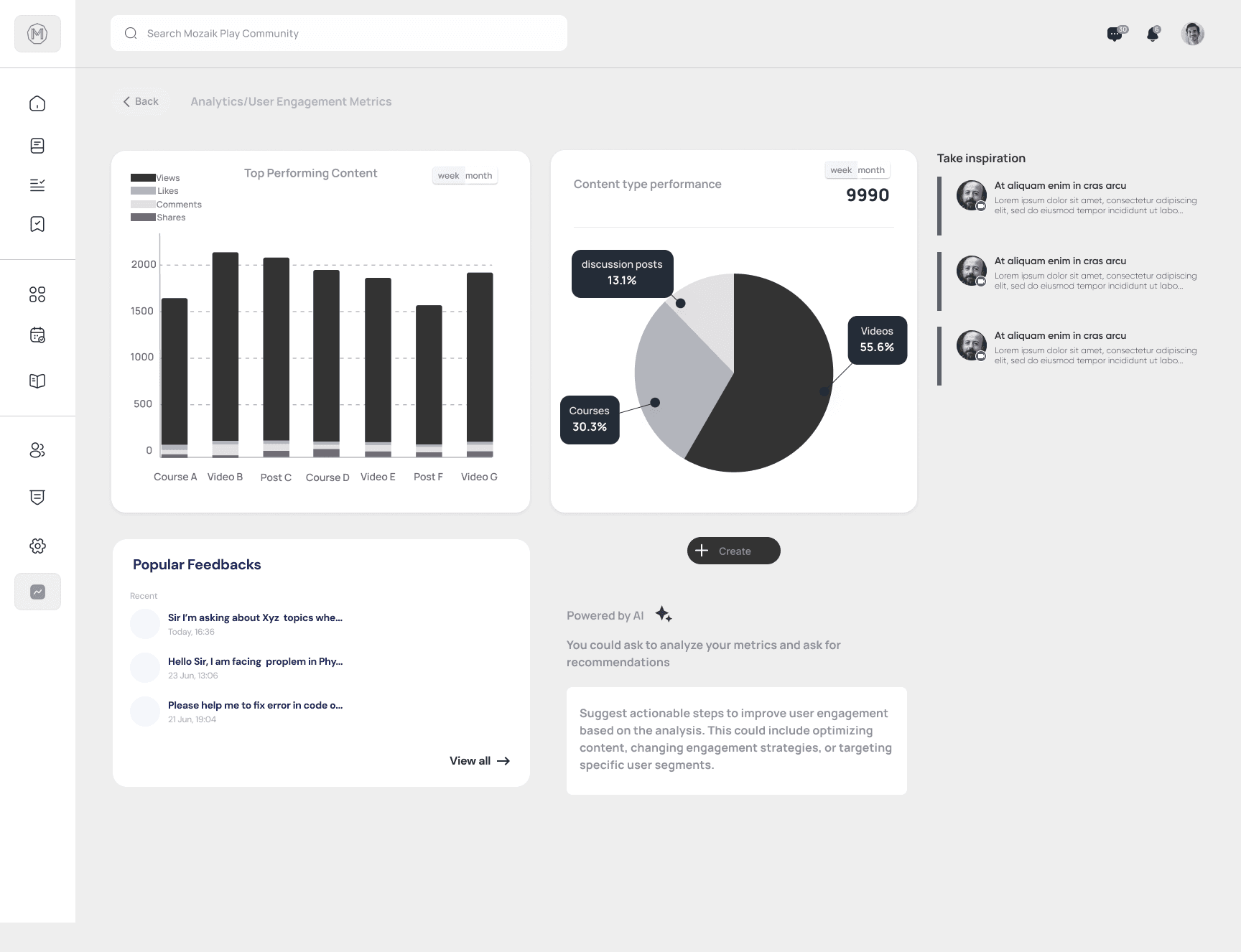
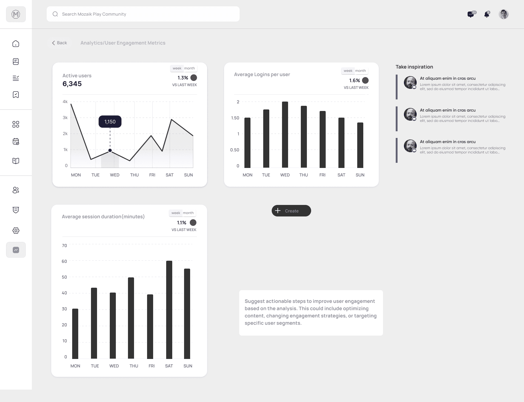
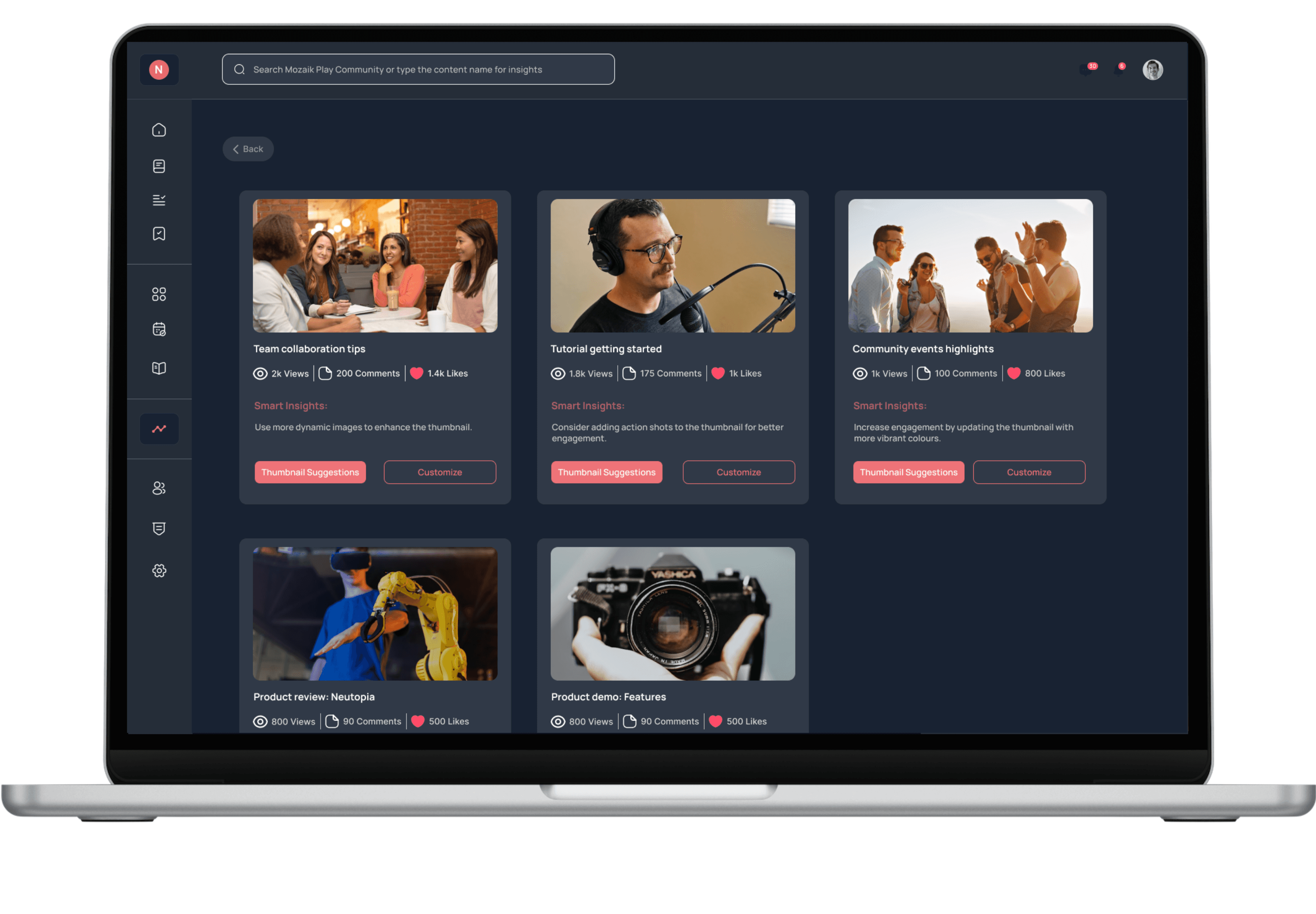
Prototype flow demonstrating content interaction metrics within the Analytics Dashboard
04 Problem:
Admins lacked the tools to reflect on past campaigns and gain insights efficiently. They needed a quick way to assess core performance without sifting through complex data.
Solution:
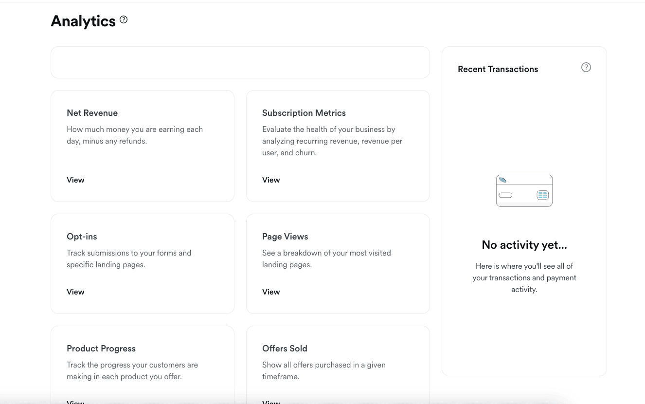
To address admins' needs for efficient insights, I designed an analytics dashboard as a central hub for accessing key metrics. This dashboard provides a concise overview with an option to "View Detailed Metrics" for deeper analysis. Linked to this main dashboard are specific metrics pages, such as sentiment analysis and a dedicated thumbnail performance tracking page ( Below is Final design of Thumbnail Analysis page), allowing admins to assess content effectiveness and visual appeal more precisely. These pages include filters, as well as options to share and download usability insights, creating an accessible, streamlined experience for data-driven decisions.
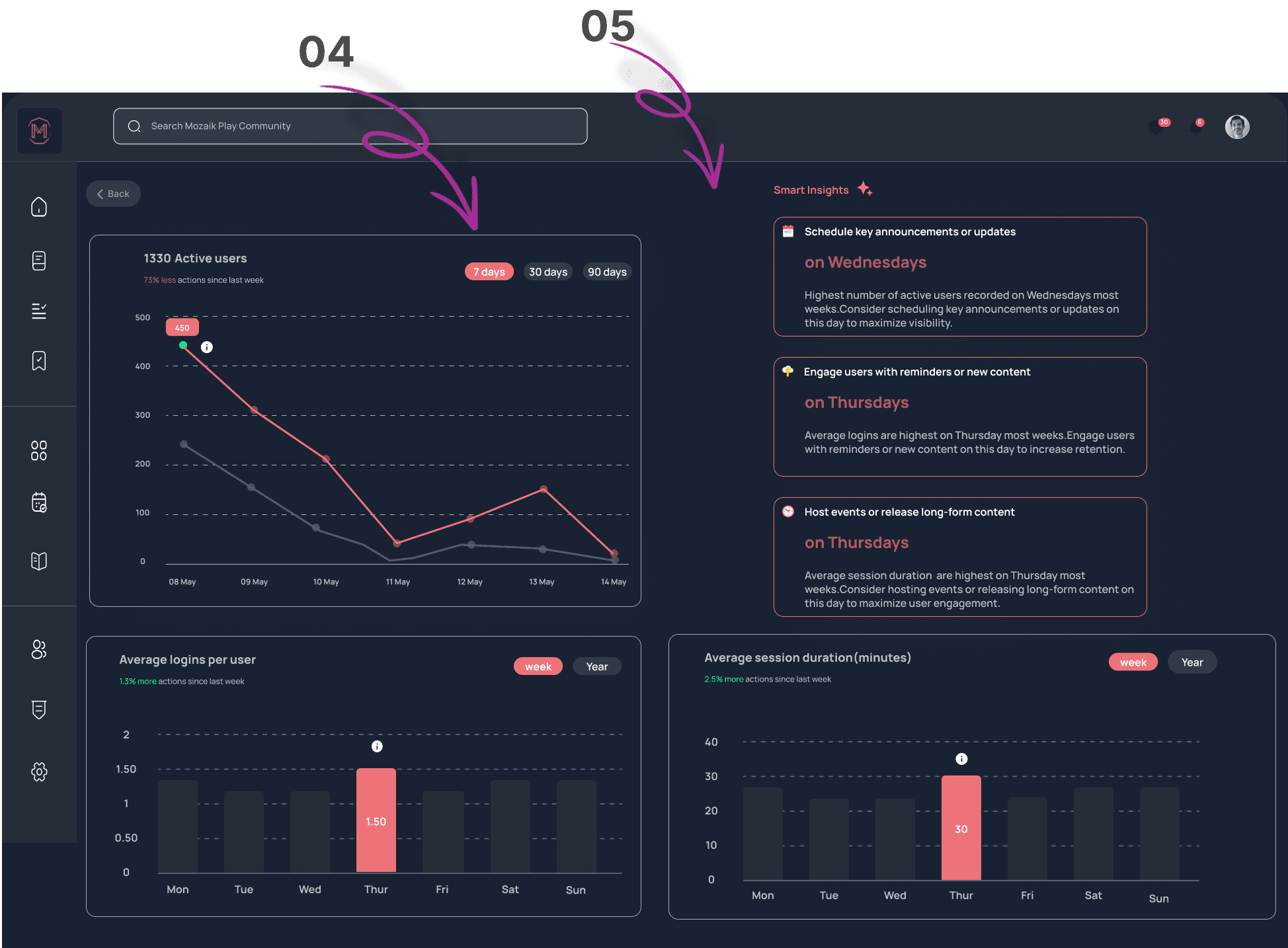
Final Design of Thumbnail Analysis page within the Analytics Dashboard
To enhance the experience, I integrated AI-powered Smart Insights into resizable, flexible cards and redesigned the UI based on insights from usability testing to make them more prominent. The redesigned cards allow users to adjust their size for easy viewing of key insights, while also sliding them to the right to declutter the interface. AI insights enhance user engagement by providing real-time, data-driven recommendations for content strategies. They personalize the experience, save time on analysis, and improve user satisfaction. By identifying trends and offering tailored advice, AI fosters continuous improvement, empowering community admins to optimize their content effectively.
Key Learnings…
Iterative Feedback
Continuous usability testing allowed for quick iterations, ensuring that designs align with user needs and preferences.
AI's Real-World Impact
In today's AI-driven landscape, it's essential to evaluate whether AI solutions genuinely address user needs. Prioritize understanding the problem at hand to ensure that AI enhancements provide tangible benefits rather than just technological advancements.